
Changes to illustration poster
–
I got feedback from people at the gallery walk last time I had one, and this is when we were showing our quote posters printed out on an A3 size poster. it was then placed on a wall and had many sticky notes on each illustration i did. The main issues found within my design was that the font size was too small and it was hard to read. The second issue that was also big one was that poster 3 ‘imagination’ background. blended in with the recording colour of the film border thing.
So i set myself out to fix these issues. In indesign I went in and changed the font size to 43pt, instead of 26pt (which was wayy to small)
Colour issue with recording
–

When it gets printed out, it blends in to the background badly and you can’t even notice it. Someone suggested me to change the colour of the background to a darker colour. I did this and changed it into a darker value as well as adjusting other issues found (i have two different styles of illustration now too so im happy).

Text size
–
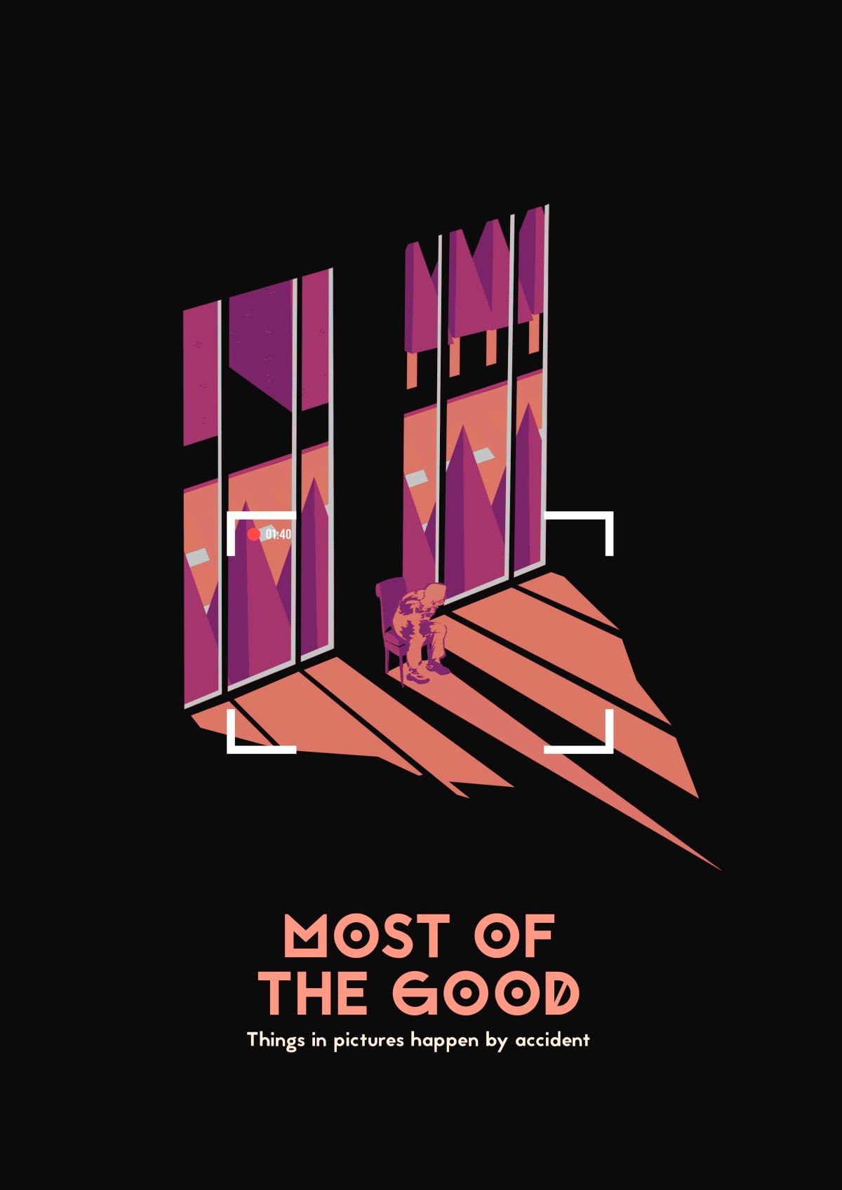

To be honest, i very much dislike adding this change as it makes the illustration look bad, and detracts from the image; but if that’s what I have to do, I have to do.This will be very much readable now as it is supposed to be printed ON AN A-2 !! NOT A3.
